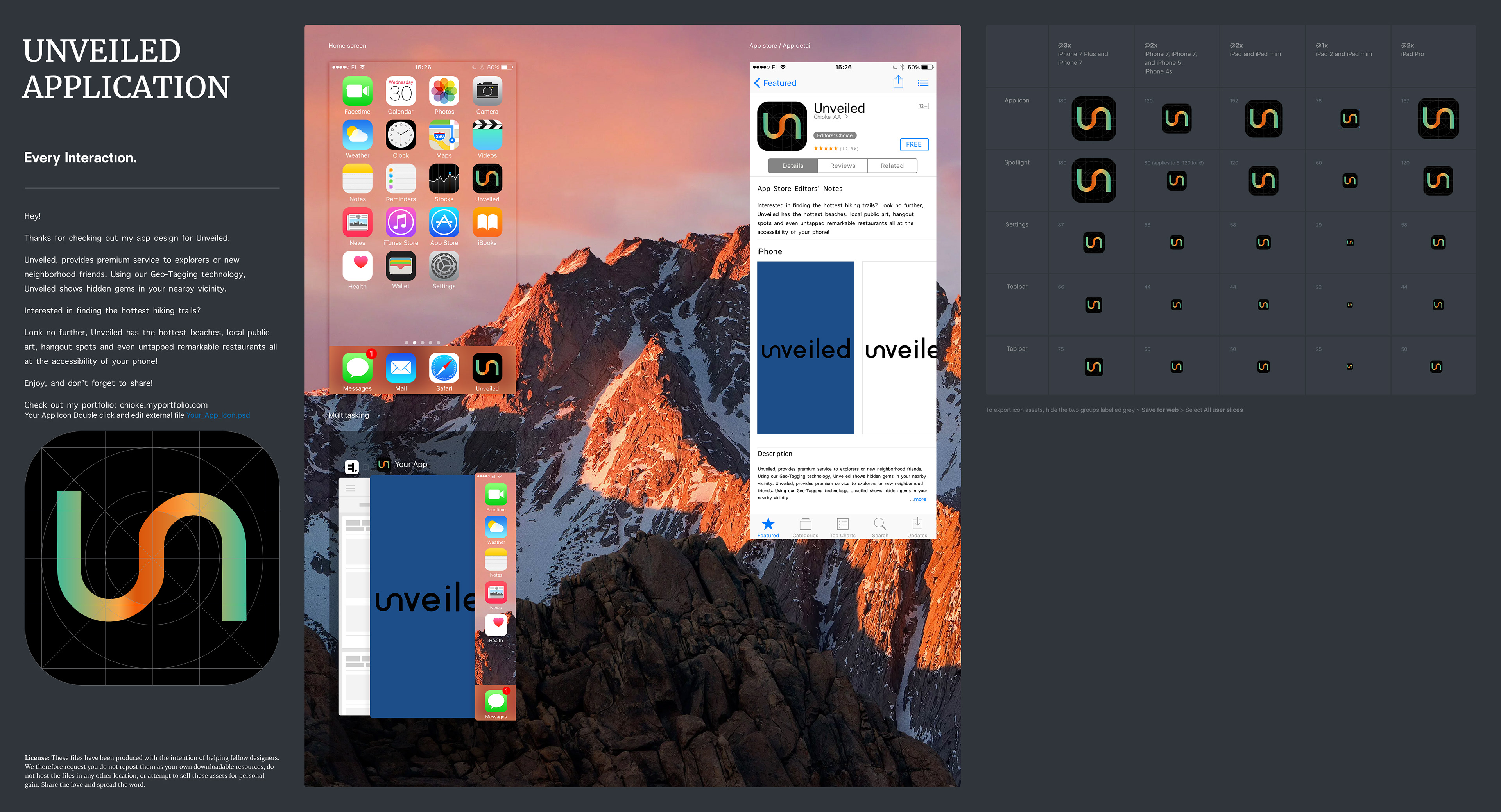
introducing an app is different than a book, the logo should represent not only what the User experience may be like. but also represent the essence and feel of what the app tries to convey.
alongside understanding the audience and how they will interact with the application, it is important to consider how color psychology and typography can affect the users' association with the application.
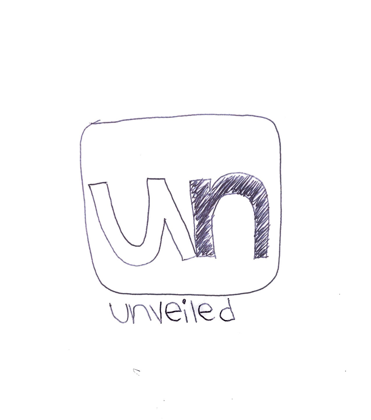
these three basic sketches were created to map out the ideas I had in mind for the essence of the app. Similar to the book cover design, I thought of keywords that captured what the app was conveying.
I wrote down
Keywords like;
adventure,
fun,
connect,
and map,
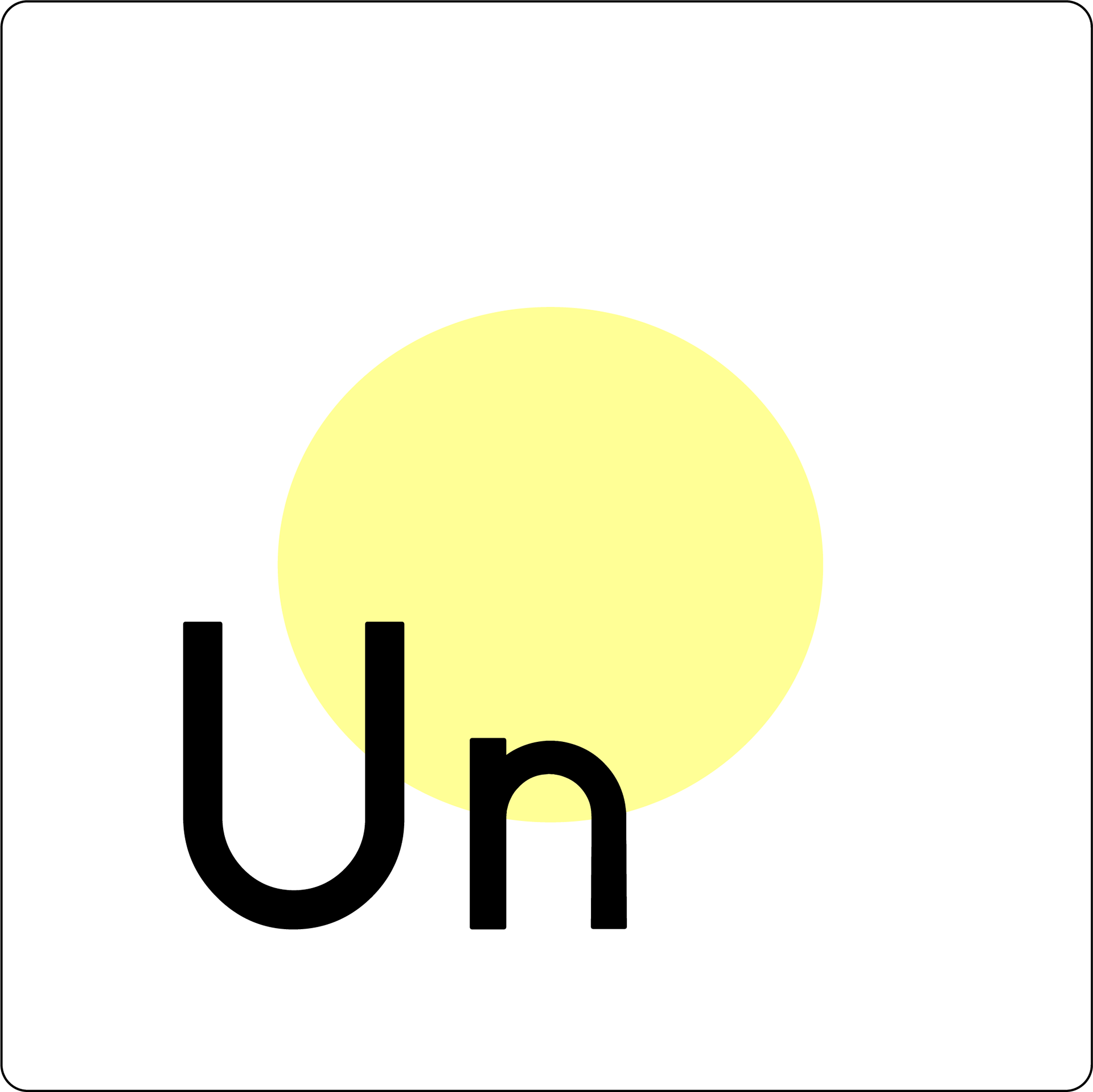

Subsequently, I began early iterations of what the app should look like in Adobe Illustrator. Initially drawing inspiration from the LinkedIn application icon. I felt that the simpler the application's icon, then the better it would be.
A basic design principle is a simplicity,
the more simple a design, the more recognizable it will be.
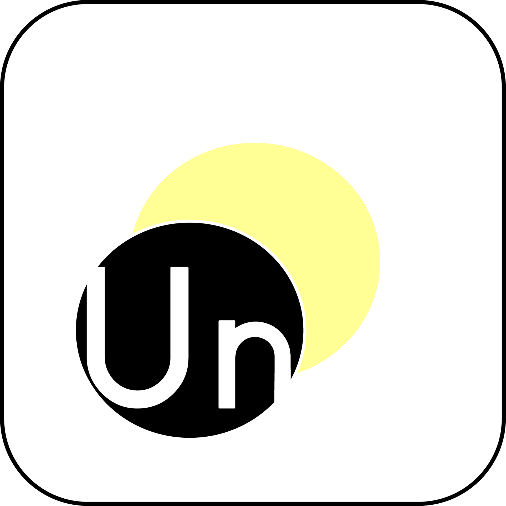
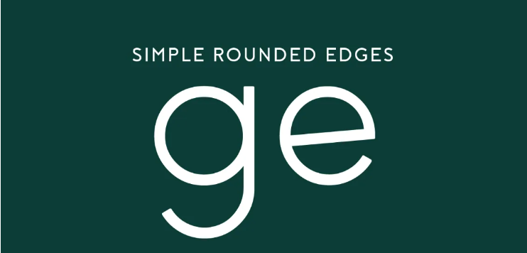
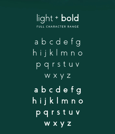
I decided to then pick a color palette and choose colors that also resonated with the keywords of the application. making conscious choices in design is a must-have when working towards an end product. ALONG THIS PROCESS I CHOSE A sans Serif font by the name of "coves". This typeface has simple rounded edges, and I felt the typeface resonated with the concept of nature and the earth.

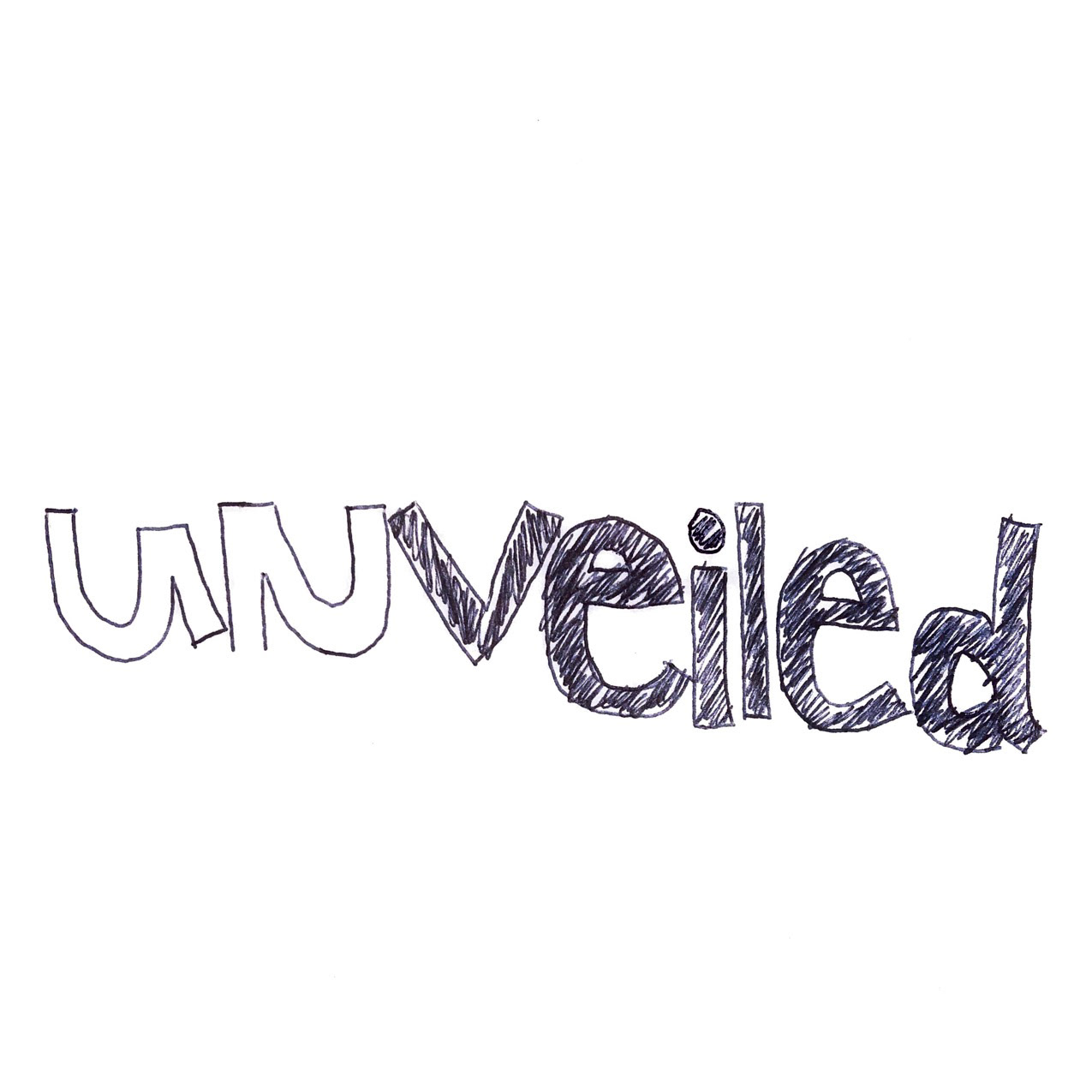
I began playing with the previous concepts of the app icon and chose to make the icon resemble a winding road to reflect the aspect of adventuring outside to discover new places. I also tried to make the winding road resemble the "U" and "N" of the name in Unveiled.
I then changed the icon to accommodate the typeface of the logo as well. using lowercase and combining the two letters with each other, I would be able to achieve the previous result while keeping the logo and icon alike. I also made sure that the two letters were evenly placed together so that the curves also met along the same grid line as the end of each letter.
I chose to keep the connection between the "u" and "n" more distinct by having the top of the "n" uncurved.