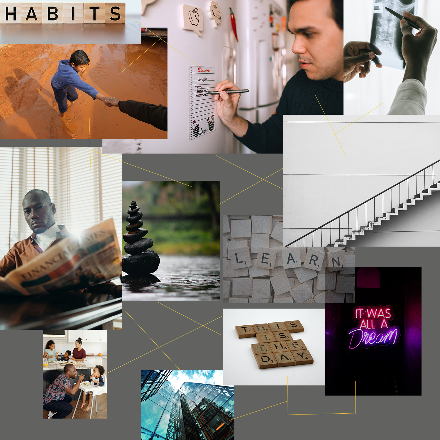
When introduced to the topic of recreating a book cover design. One of the first steps i took was creating a mood board of images or emotions associated with the book.
the mood board provided a good basis for mapping out images that I associated with the book. I then wrote down associated
Keywords like;
routine,
learn,
process,
envision,
and discipline
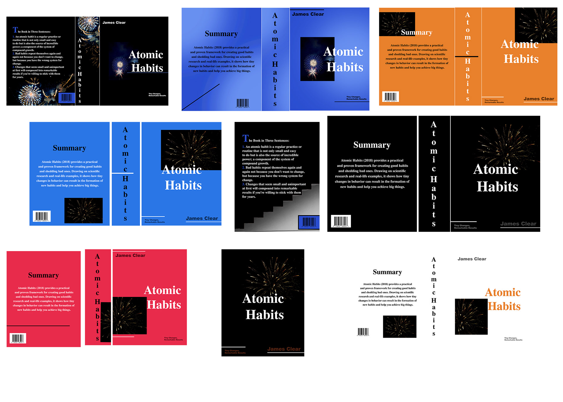
I then quickly sketched the ideas I had for what a possible front cover could look like. and then proceeded to make quick iterations of these in adobe photoshop and illustrator. After creating these iterations, I went through each one and thought about what related back to the content and keywords the most as well as looked visually appealing. i then chose three iterations that were my favorite. eventually, i landed on the fireworks iterations.
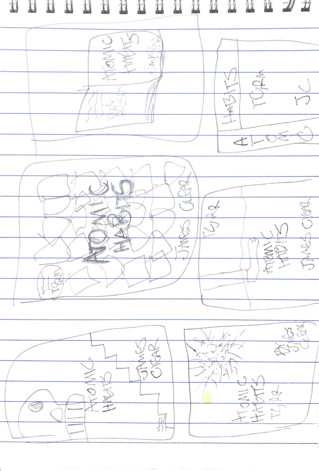


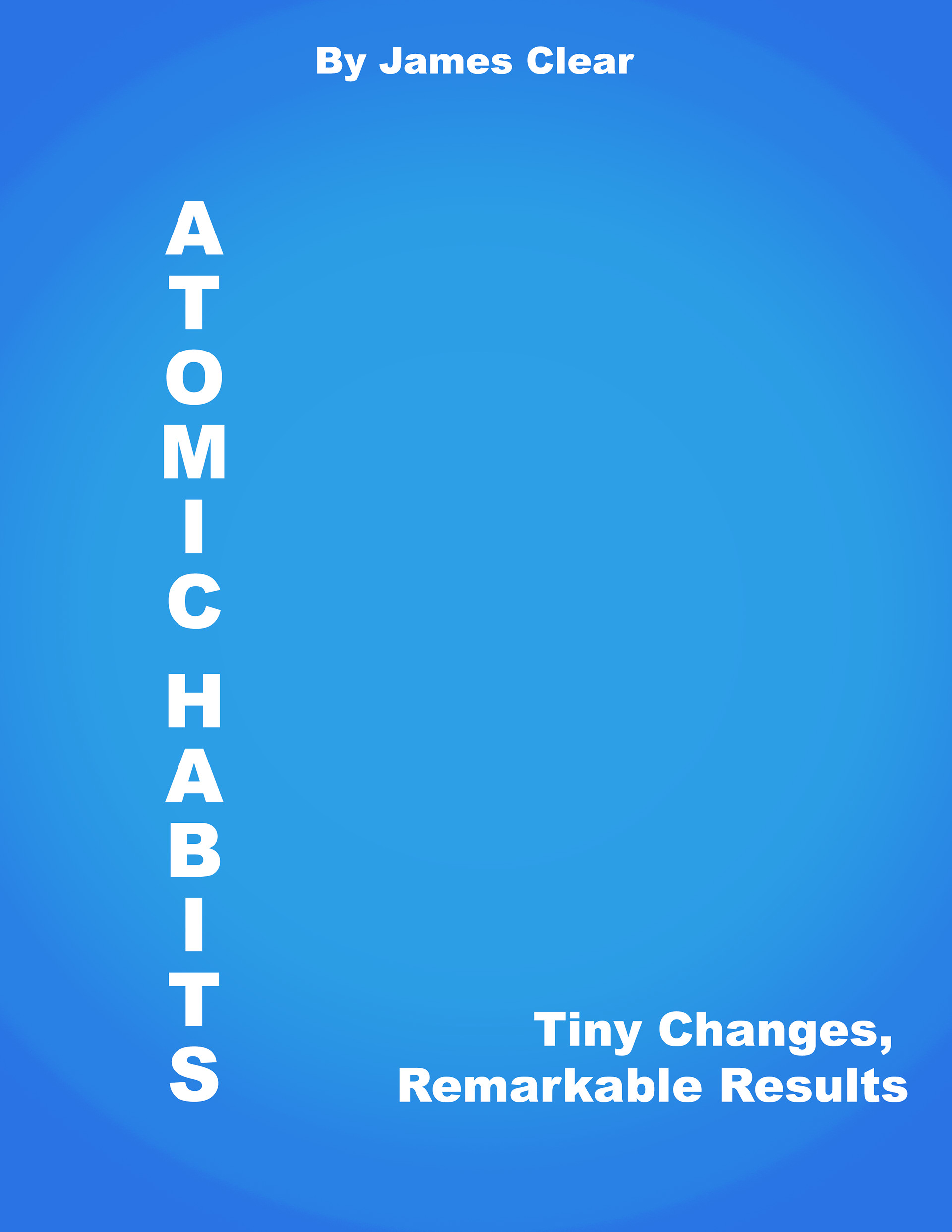


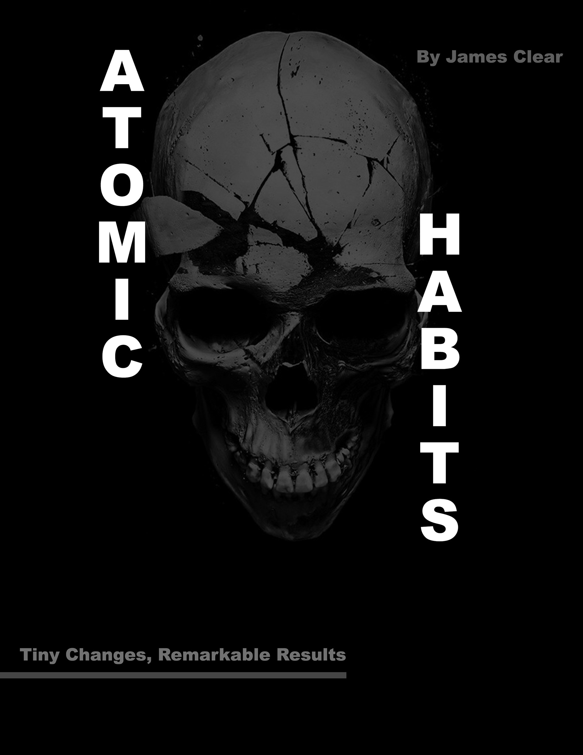

upon choosing the firework cover, I created different color schemes based on this concept. after looking through all of the iterations i had made i began thinking i was missing something. i asked a few acquaintances and family members their critiques on the firework iterations:
what are 3 things they like,
3 things they dislike
and what it reminds them of.
it came to my attention that a lot of questions i received were, what do fireworks have to do with a book about habits and discipline? the only connection I had made in my mind between fireworks and the book was the title.
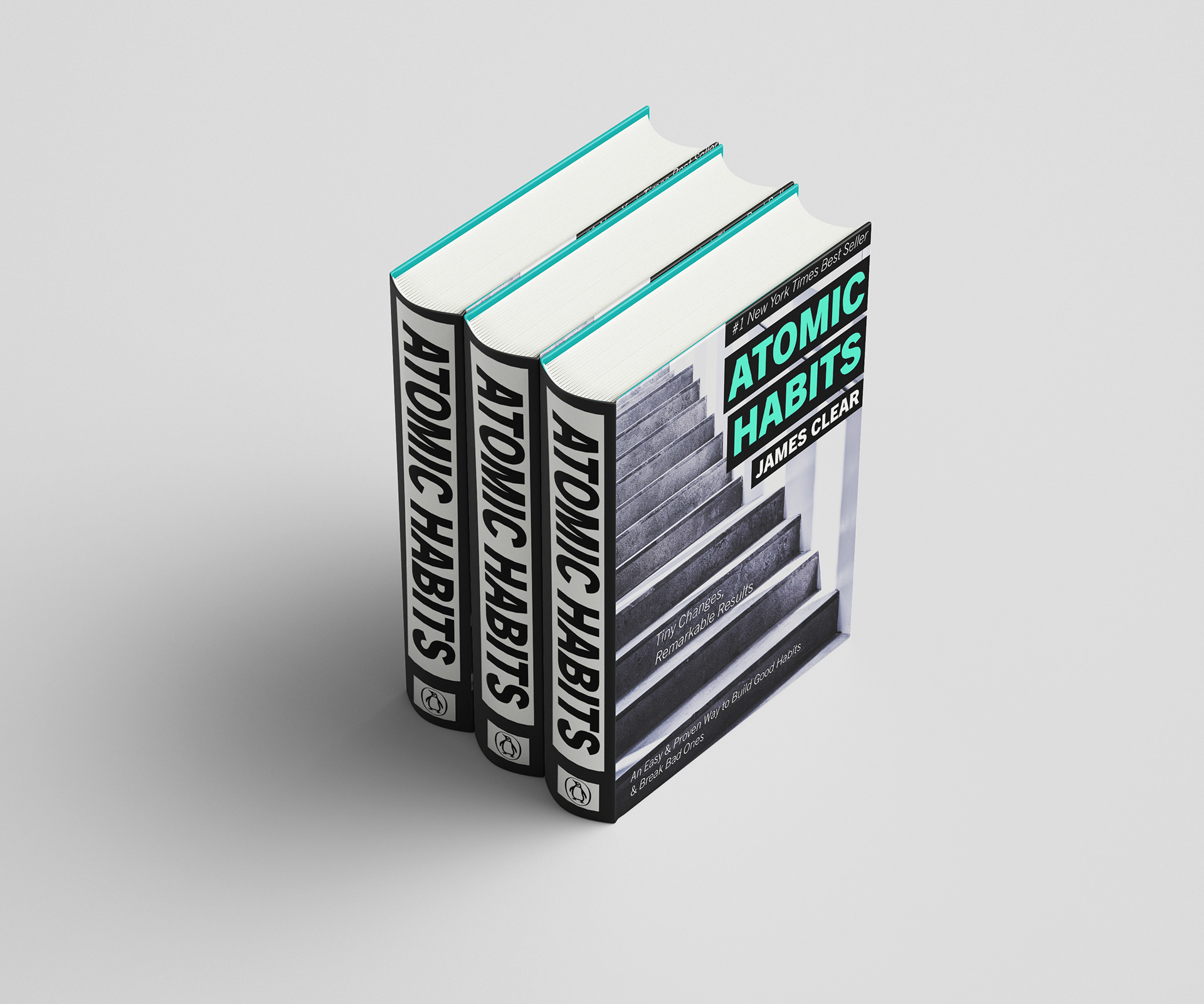
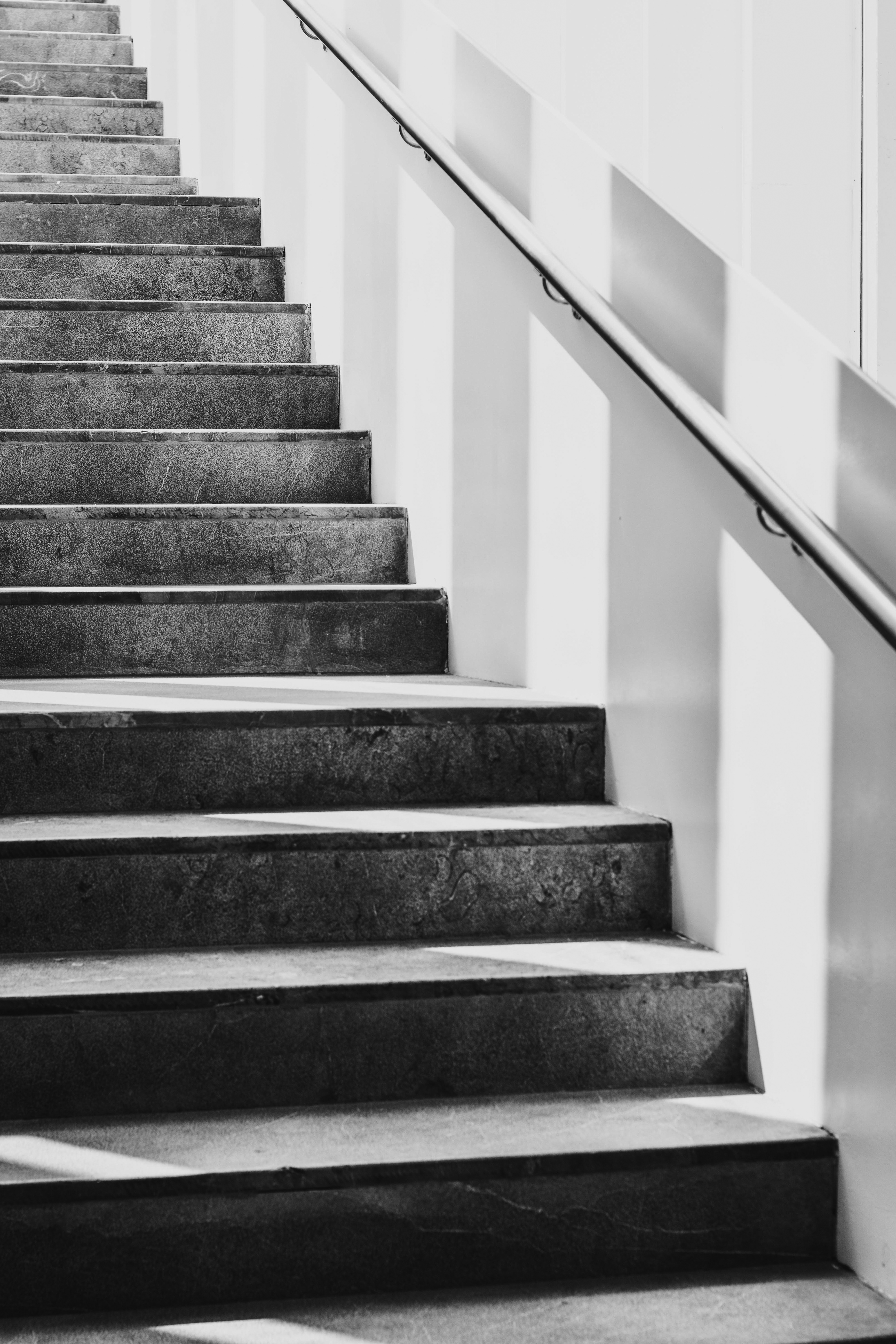
i chose to completely change the imagery for the book cover and go with the previous concept with stairs. I immediately went with image 1, the left with the perspective of facing the stairs. i felt this was much more compelling and brought attention to the image more.
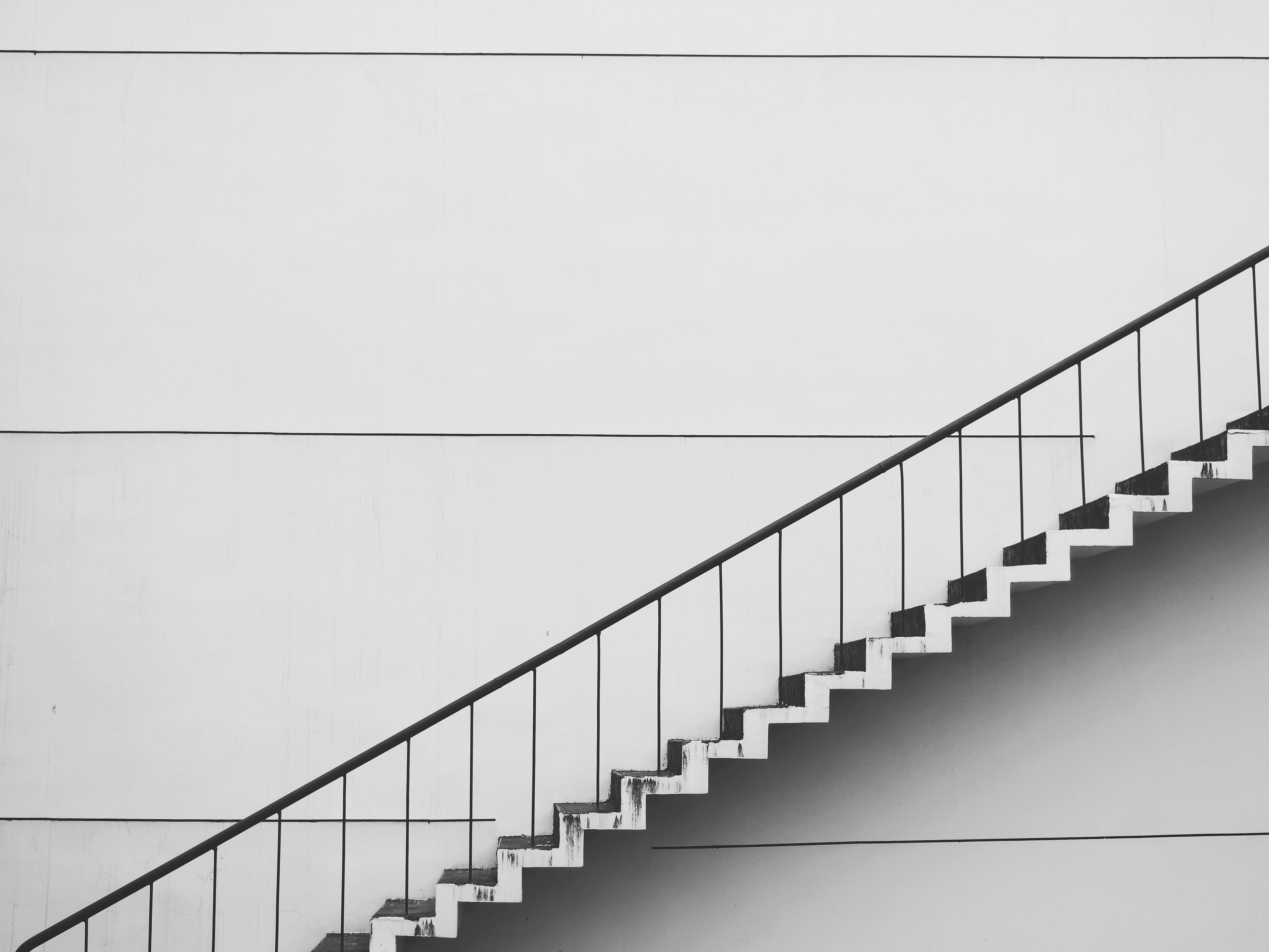

The first iteration was proving to be in the direction of what i had in mind however, there a few less than ideal technicalities with legibility, typeface, kerning, proximity, and balance. based on this i decided to not only move the heading and subheading but also remove some text and change their coloring as well.
sometimes great design can happen by accident
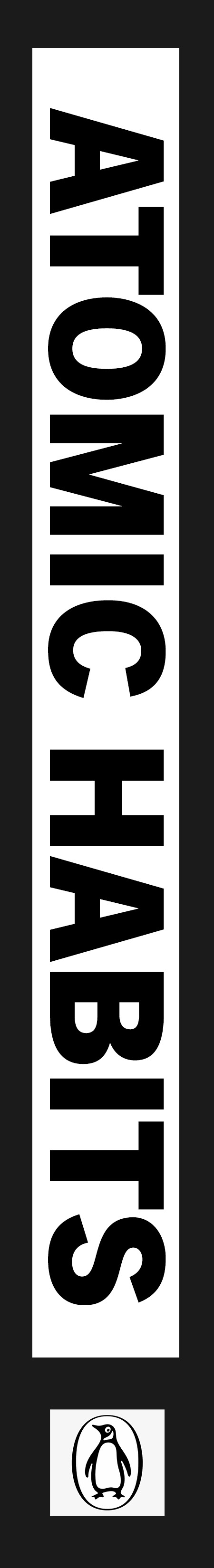
while i was in the process of moving text around and deciding on its colors. i highlighted the heading and was captivated by how it popped out and further promoted visual hierarchy. i made a design choice to make the heading, subheading, and 'new york times best seller' caption highlighted in black. A visual hierarchy with font color choice, size, and shape with the 'black rectangles'. Choosing to aligne the text with the flow of the stairs and most likely visual attention.
the colors I chose:
new york times bestseller:
r: 172
G: 8
B: 51
atomic habits:
R: 79
G: 253:
B: 204
James clear and all other text is 255 for all RGB. with that i was finished with the front cover.


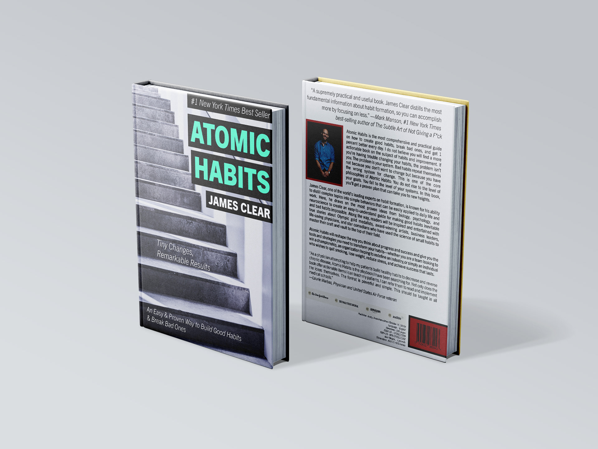
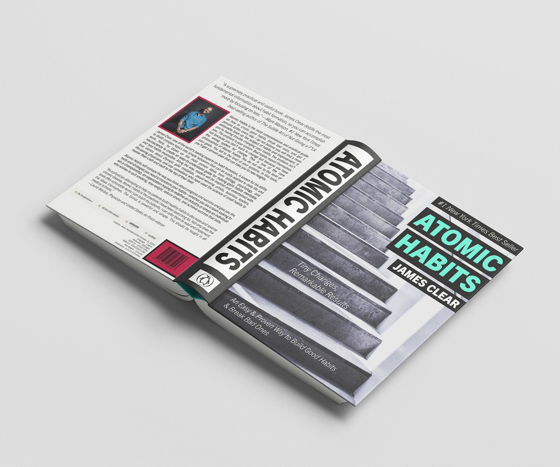
The spine and back were fairly simple and straightforward. a matter of matching color palettes and standing out different from the front. i drew inspiration from Octavia E. butler's fledgling back layout. with that i was finished.